Daffodil Day
Tribute Garden ideation and development: mini case study
Cancer Council
Previously the Tribute Wall, the Tribute Garden is a community function of the Daffodil Day website, and serves as a way for users to share their cancer journey with others. The existing Wall was lengthy and didn’t allow for explorability.
Overview
I designed a refreshed Garden that focused on interactivity between community members, and encouraged the sharing of stories.
The Impact
Duration
Took place over the course of the Daffodil Day website refresh
Tools
Miro
Figma
Google suite
Microsoft suite
Due to confidentiality, I’m unable to share specifics of the work completed, but this case study outlines the work I undertook from a top level point of view.
My role
Wireframing
UI development
Discovery
The Tribute Wall was originally created as a way for members of the community to connect. Due to Daffodil Day being a known campaign nationally, users were happy to participate.
During the update of the Daffodil Day website, I saw the opportunity to grow the Wall into something more, and proposed that we update the functionality to include more visual elements, and include more of the ‘daffodil’ theme.
I thought about what users would be looking for when contributing to the Tribute Wall
The users are people from across the community, who want to share a cancer story. This could be their own, or to show support for a loved one during a trying time.
They are looking for a sense of connection, to not feel alone when faced with cancer.
They are looking to share memories of friends, family members, and share pictures with others who are able to sympathise.
Before
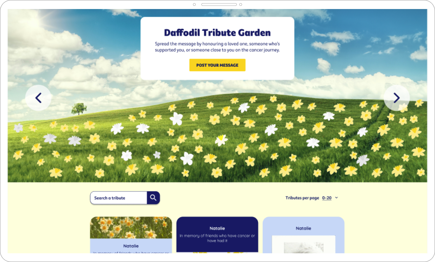
Uninspiring hero section is difficult to read, and asks users to ‘post a message’ without context.
Submission form takes up valuable real estate on page, pushing the tributes below the fold.
The tributes themselves are on one page, meaning the page took a while to load, and caused fatigue due to the length of scrolling required
The tributes lacked interactivity, so users were unable to see pictures closely, share with their social network, or support others using the Wall.
Ideation
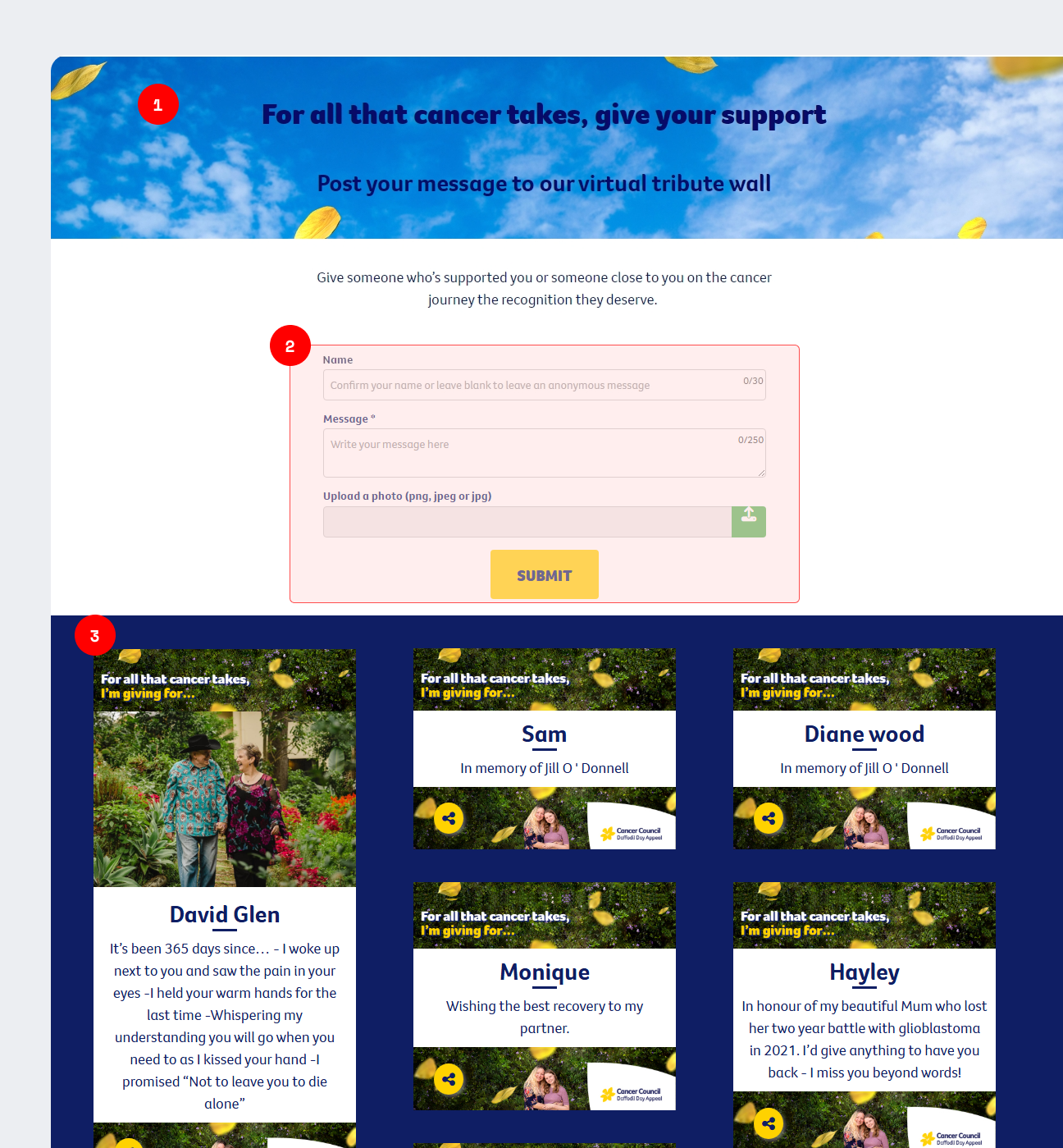
I was limited in terms of functionality for the Wall, but knew that there were similar options available through the developer.
I based my design around places where you would naturally see daffodils - in a garden scape. The idea is that users would see a sea of daffodils upon entering the page, and could click on each daffodil to read a message. Users could then ‘like’ tributes, and directly share with their network to promote their message of support.
Due to limited time, and to aid with stakeholder management, I designed the Garden in high-fidelity.
V1: Included daffodils into a large scene. Users could search for a tribute in the header, and scroll down to see a selection of tributes in written form.
All tributes now have the option to like, heart, or share.
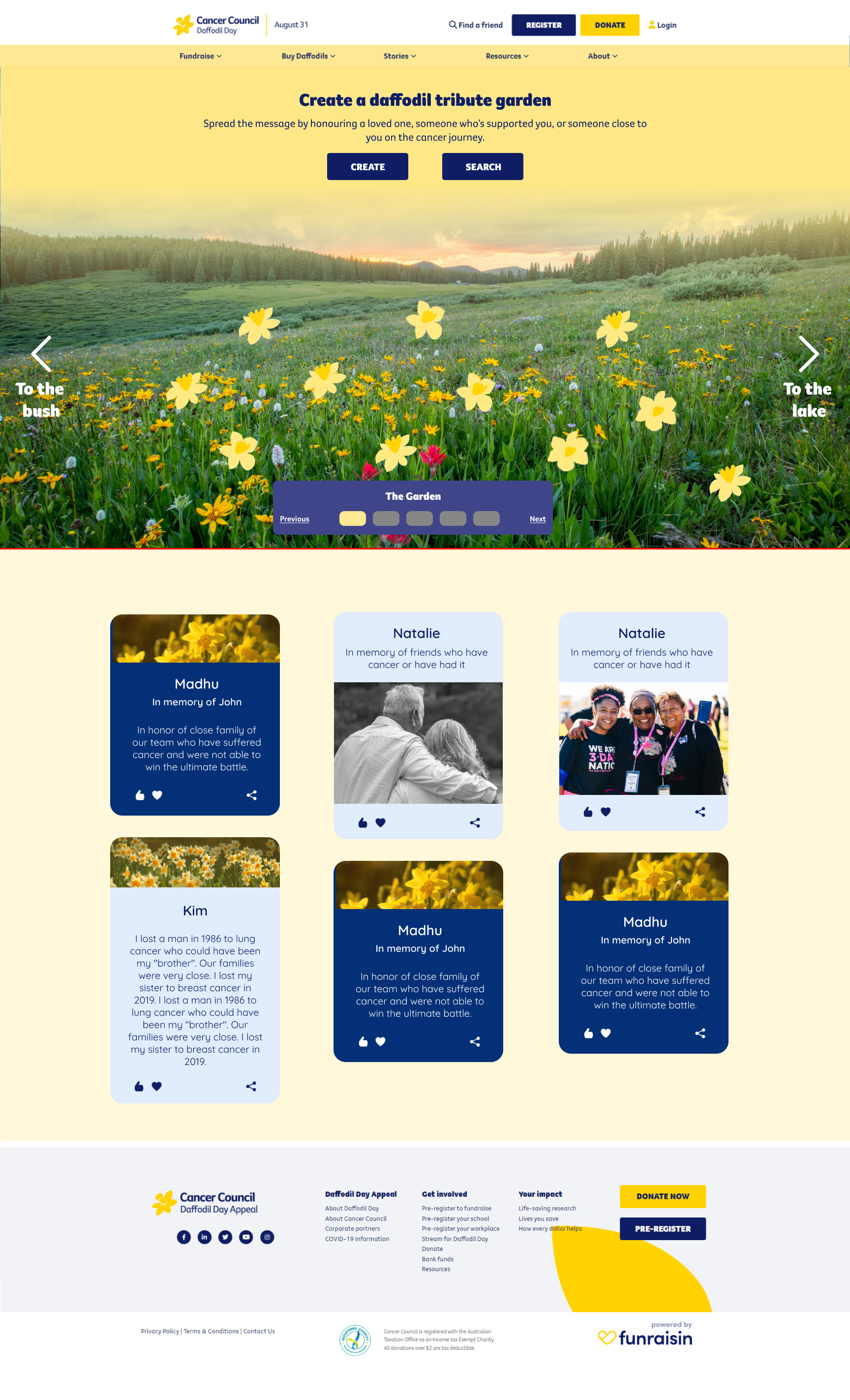
V2: Placed more emphasis on multiple ‘gardens’. This was to encourage users to find a garden that suited them the best.
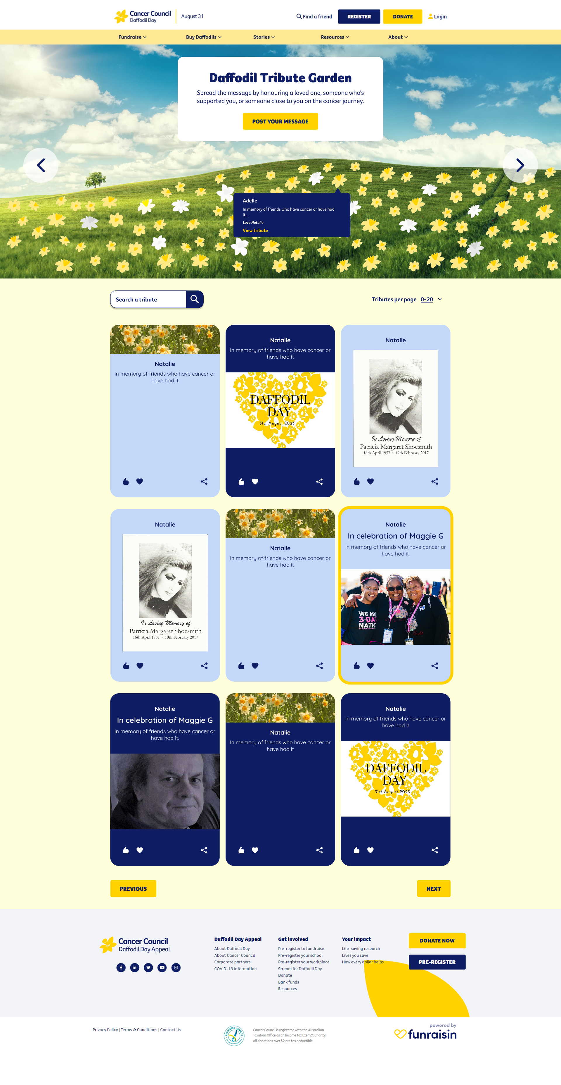
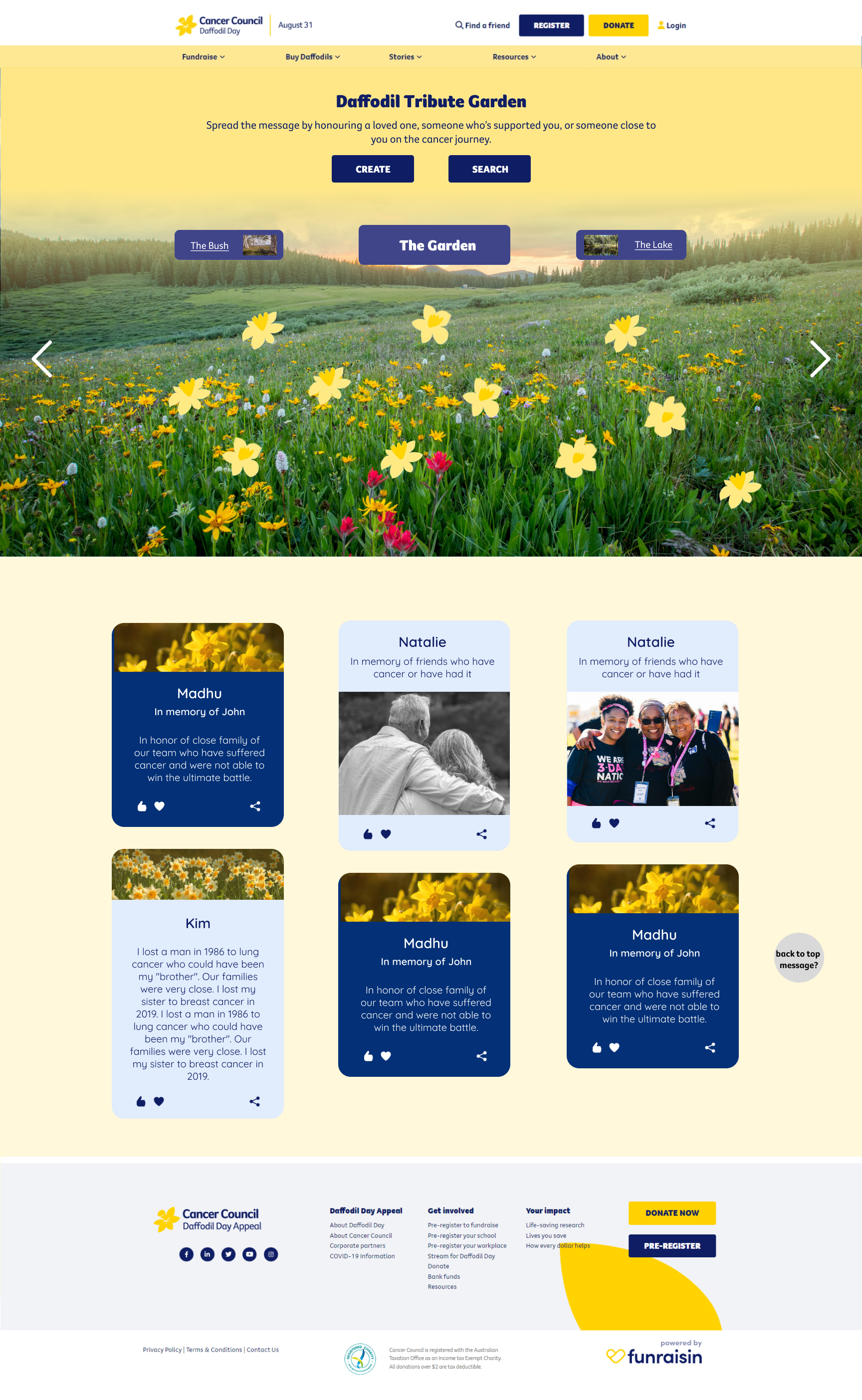
V3 (chosen): Placed more emphasis on the sea of daffodils, filling up the screen. Search functionality is moved below the field, and the addition of pagination allows for a shorter page load.
Outcomes and Reflection
+13%
tributes made
+4%
engagement time
I really enjoyed working on this little side-project, as it allowed me to think about how to solve a problem in a way that was outside of what would normally be expected for Daffodil Day. It was interesting working with so many stakeholders on what was expected to be a simple solve, but I’m happy with the outcome of the Garden, and seeing the yellow daffodils fill the screen really does create a sense of community.
I chose to design in high-fidelity, as there would be a few stakeholders to manage and so it was easier to communicate the designs this way. In future, I would work with more low-fidelity wireframes first, as this will allow for faster and better iterations, and create a moodboard to go alongside the wireframes to give a sense of what’s to come.