Daffodil Day
Website Functionality Refresh
Cancer Council
Daffodil Day is a well known event in Australia, with the yellow daffodil being a symbol of hope for those on a cancer journey.
The Daffodil Day website is a place fundraisers and donors can land to help raise money for cancer research, or for supporters to come and find ways to get involved in the campaign in their community.
Overview
This project had a truncated timeline, with the refreshed website needing to launch in less than 6 months after being briefed in order to align with the the campaign launch. Being a national project, and working with all Cancer Council’s across Australia meant that our timelines also included lengthy approvals processes.
It was decided that the research phase of the project would be limited to competitive analysis, analytical analysis, and previous user feedback.
The site houses information for Cancer Council’s across Australia, which lead users to be unable to find information relevant to their state/territory, confused about how to participate, and feeling overwhelmed with the fundraising sign up process.
Challenges
Working with another UX designer, we simplified the website experience for users, allowing easier fundraising registration and donations.
Through the implementation of best practice e-Commerce funnels, a simplified layout, and a refreshed navigational structure, the website saw conversion rates for donations and fundraising increased across Australia.
The Impact
Duration
6 months
Tools
Miro
Figma
Google Analytics
Looker Studio
Google suite
Microsoft suite
My role
Project management
Market research
Analytical analysis
Data synthesis
Wireframing
UI development
Due to confidentiality, I’m unable to share specifics of the work completed, but this case study outlines the work I undertook from a top level point of view.
Discovery
Users of the Daffodil Day website were already defined by Cancer Council as:
People who want to fundraise. Fundraisers are the primary user base of the Daffodil Day website, and could include first time fundraisers, or those who have been active fundraisers for years. This stream of users could fundraise in their own way, through work, or through school
People who want to donate. This could be users who want to give to cancer research, because they themselves have had a cancer journey, or Daffodil Day is simply a cause they feel passionate about.
People who want to support in other ways. Supporting cancer research through the purchasing of flowers was previously a large part of the campaign, however COVID diminished this portion due to restrictions on physical purchasing. Those wanting to support in other ways may want to be part of the campaign without fundraising or buying flowers.
Due to the restricted time frame, it was decided by the team that I would focus on two main optimisations:
Simplifying the fundraiser registration journey
As fundraisers made up the majority of revenue raised for the campaign, it was important that the onboarding journey for these important users was as simple as possible.
In previous years there had been feedback from users that the registration process was too lengthy and confusing.
Reducing friction in the website menu
The website menu assumed users already knew what they wanted to achieve, and didn’t account for new users, or those who were browsing and wanted to learn more.
The structure also did not allow for the creation of new pages or additions to be made to revenue streams.
Through an initial site-wide evaluation, I found:
Website menu assumed users knew what to do, and did not prioritise the primary actions we wanted to users to take, i.e. fundraising.
Site templates did not accommodate accessibility needs. All main page templates focused on text over imagery, which in many cases made the copy illegible at best, or unreadable at worst.
Key CTAs were vague and assumed all users already knew what ‘Register now’ meant. These links also pointed directly to the fundraising form. This meant that users were not given context as to what they were registering for.
Main page content was not in importance order and focused on the impact of the campaign, rather than highlighting the importance of fundraising and donating, and how to do so.
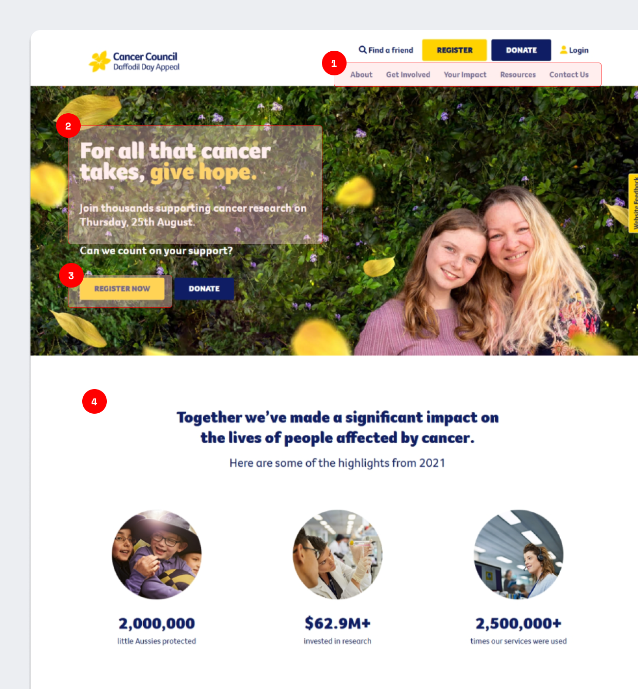
Before: Homepage
Before: Navigation
‘About’ was placed in highest importance in the menu. This section was one of the least viewed on the website.
‘Get Involved’ terminology and structure meant that new fundraisers were confused about what they needed to do.
Resources were housed in the top level of the dropdown list, meaning that they were often missed by users looking for posters etc.
Redundant pages were present in the navigation, such as ‘Lives you save’, which received less than 1% of the total website views.
Before: Registration form
Each fundraising ‘idea’ had it’s own form despite there being no difference in the sign up process from a user point of view.
All forms were structured in the same way, meaning that ‘Organisation’ details were still present on the individual fundraising form.
Terminology assumed users knew what was expected of them. We often received calls from business or school fundraisers unsure about which personal or contact details they needed to include.
Ideation
As the website needed to accommodate for a variety of users, I determined the most important actions each group needed to take:
To be able to easily see the fundraising options available. Being able to understand all the options was important, as there were multiple opportunities to fundraise, including a new streaming option.
To be able to sign up to fundraise. Being able to register to fundraise was of importance, not only from a business sense to be able to forecast revenue (based on averages), but from a user sense having a simple registration process will help you feel at ease in knowing that the platform works in an expected way.
Fundraisers
To be able to easily donate upon entering the website. Previous research conducted on the website found that users who come to the website with the intention of donating are not looking to browse or learn more, so ensuring that the donation process was as easy as possible was important.
Donors
To be able to find flowers or merchandise quickly. Each state/territory has it’s own shop functionality and sold different options (e.g. boots, pins, hats etc.), so directing users to the relevant area was important.
To be able to contribute to the campaign in a meaningful way that wasn’t fundraising or donating. This could be through sharing their cancer journey, or signing up to volunteer.
Contributors
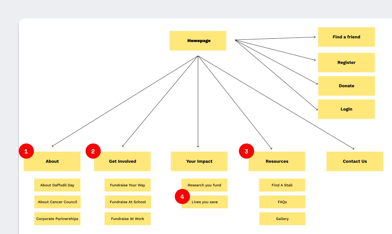
Navigation and Customer Journey
Plotting a journey for each user, I found that fundraisers and contributors had the biggest barriers for entry.
For fundraisers, there were multiple points of entry, and no clarity about what each of the fundraising options where, leading to frustration in not knowing if they’re doing the right thing.
With four different options to fundraise, fundraisers were often confused about which option to choose.
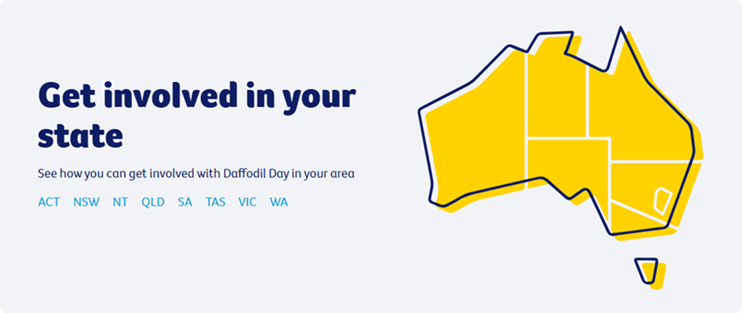
For contributors, the only way to know what was going on near you is to find one of these maps.
This was not linked in the navigation, and was often hidden in top-level pages of the drop down, meaning they were often missed.
Then looking at the analytics of how each page in the navigation was visited (organic, search, social etc), and what kind of activity each received, I reworked the navigation in order to suit the needs of our users. I also wanted to make sure that the navigation allowed the team to create new pages, with a clear structure of where content naturally fit.
Design
After mapping our user issues, and working with the team to manage our internal priorities, I developed the following designs:
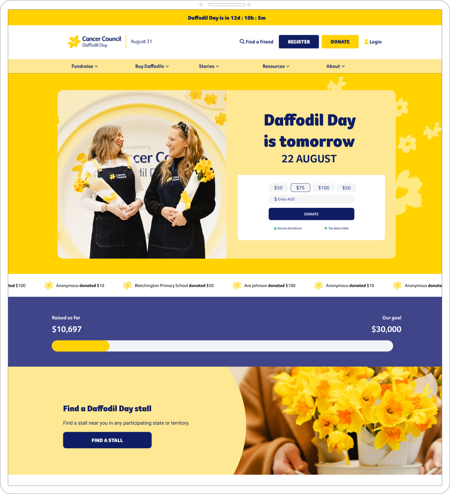
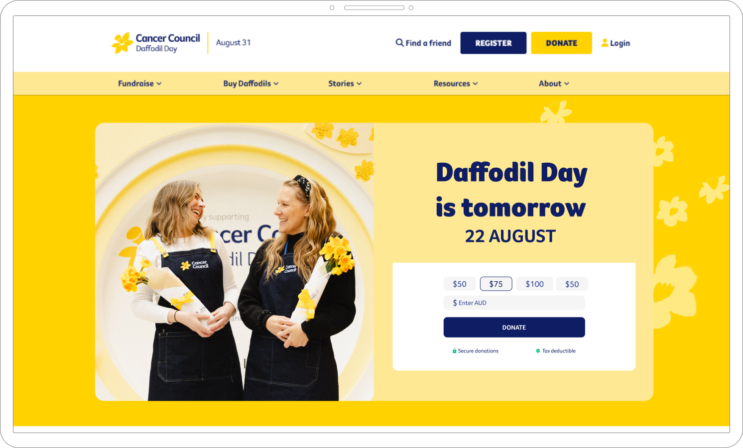
Website menu guided users directly to where they needed to go.
Content on page was truncated to what we want users to do, and removed the lengthy blurbs about what Daffodil Day is.
Key CTAs are clear. In this instance, the donation function was the priority, and so that is what users saw above the fold. This was followed by a clear ‘Find a stall’ button below the fold.
Site templates include plain colour areas to allow for text to no longer sit on top of imagery.
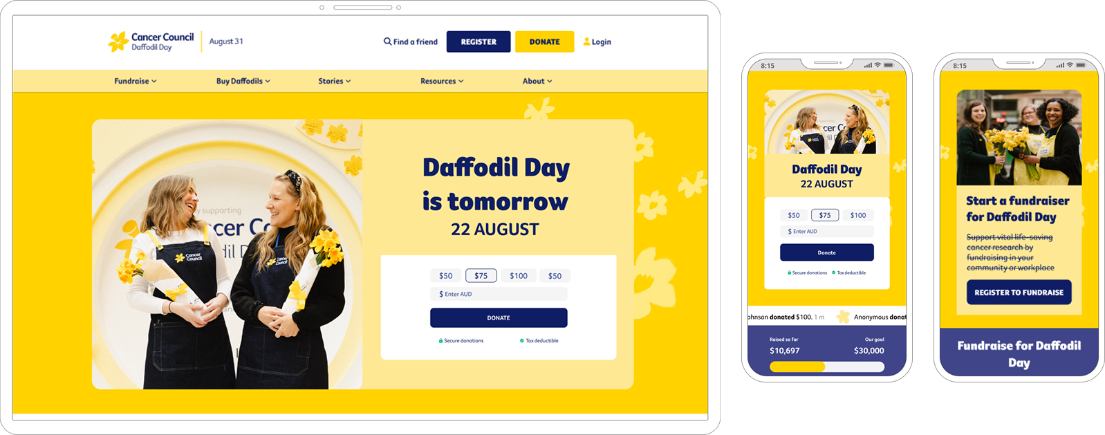
After: Homepage
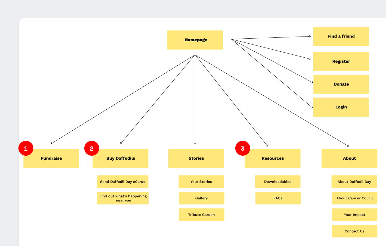
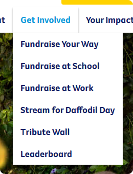
After: Navigation
‘Fundraise’ was in the hero spot, and a singular page that funneled all fundraisers to the registration form.
‘Buy Daffodils’ aligns with terminology that users would expect, and allows users to find a campaign near them to interact with.
Resources are now housed within the ‘Downloadables’ dropdown. This has reduced the number of calls received asking where to locate them.
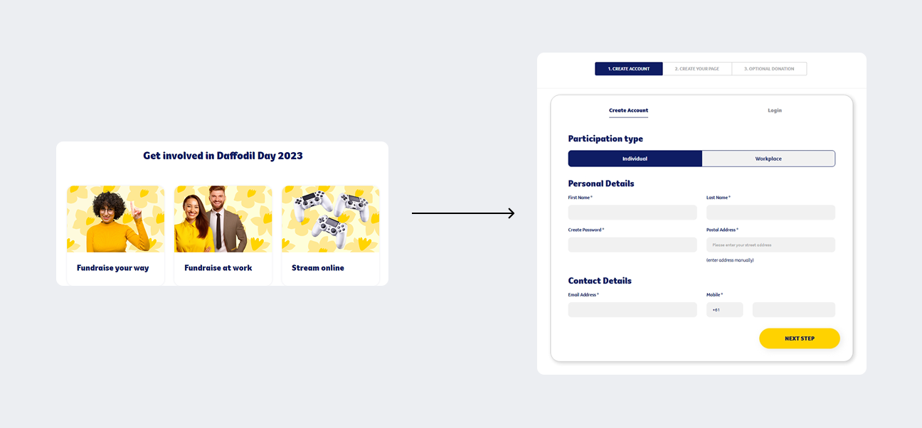
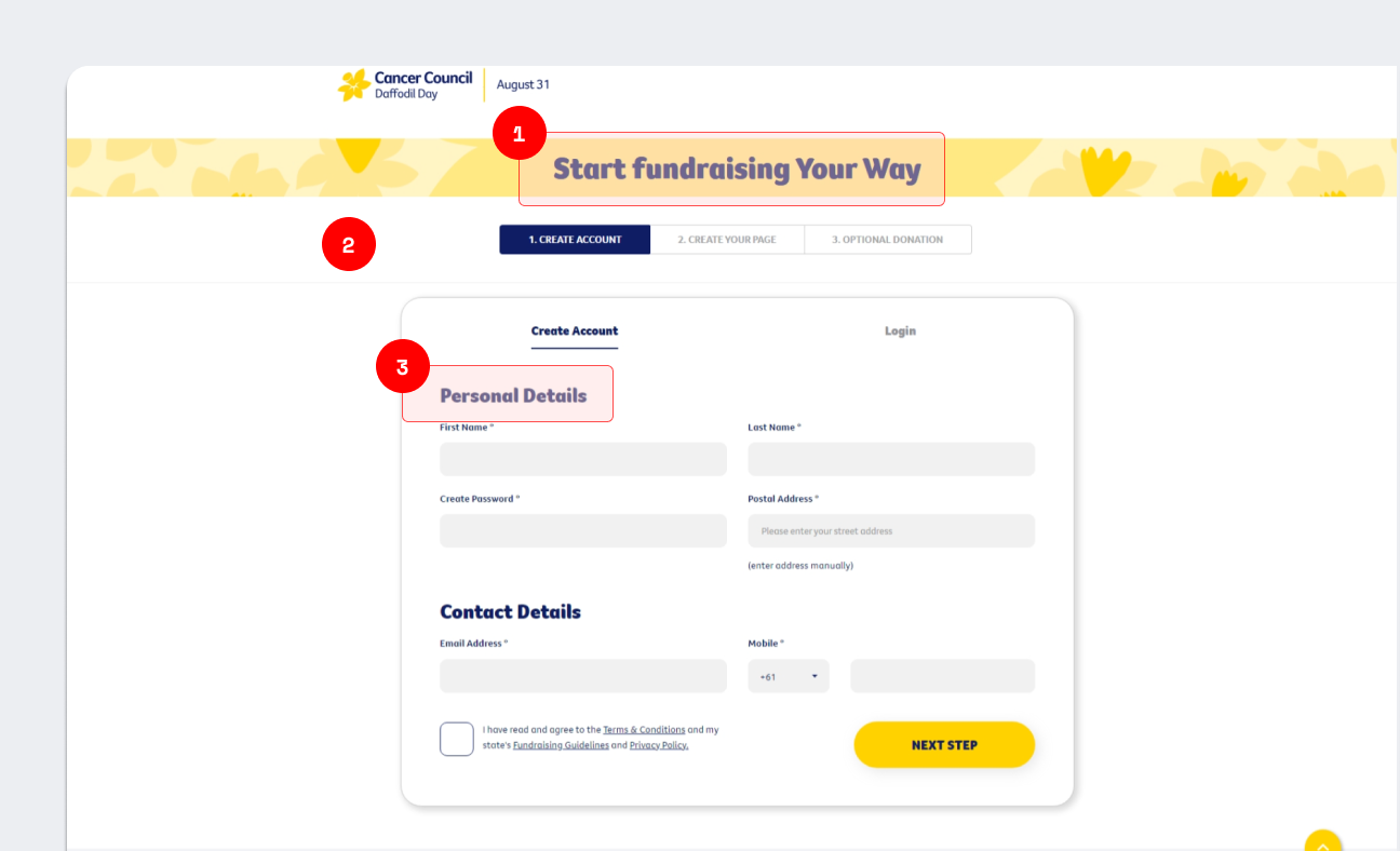
After: Registration form
All fundraising options use the same form for ease of use for fundraisers.
Fundraisers no longer need to decide how they want to fundraise before completing their registration.
Terminology on the form changes depending on which option is chosen (Individual or Workplace fundraiser), so users are aware of what is expected of them.
Outcomes and Reflection
Due to confidentiality, I’m unable to share specifics of the outcomes.
Large decrease in drop offs in the registration flow.
As a result of the form optimisation, fundraisers were now more likely to continue completing the registration form than in years prior.
Significant increase in traffic to state and territory page.
Contributors were now easily able to search and find out what was happening near them.
Because Daffodil Day is such a large and well known campaign, it was really exciting to have the opportunity to revamp the website, not only to make it easier for our users to complete their tasks, but to align the website with the look and feel with the physical campaign the public were interacting with.
I’m proud that I was able to make a difference in the usability of the site, and am happy with where the website landed. In the future, I would like to have a larger team of designers working together, as that would allow the visuality of the campaign to shine through more.
Working with a large group, especially nationally, allowed me to learn how to best collaborate with people sitting across all segments of a business. This was an interesting one because the members of the group all had different priorities and measures of success (e.g. fundraising, donations, community building), which didn’t always align, and sometimes clashed with what was best for our users. Having this experience showed me how to communicate with larger groups like this, and how to manage differing stakeholder priorities.