Mountain Goat Mountain
eCommerce Website Exploration
Threshold
Overview
Threshold is an online platform that provides families, in particular those with young children, the opportunity to celebrate the small moments in life.
It specialises in audio-theatre experiences and at-home games for families with younger children who are looking for ways to those special, foundational memories.
Our client defined their users as mothers in their 30s-40s, with young families, who were looking to create family experiences without the use of screens and devices.
After it’s release, Mountain Goat Mountain (MGM) was receiving positive reviews, and traction through community venues,
However, the Threshold website wasn’t optimised for sales, and so the product page for MGM was seeing high levels of user drop off in the sales funnel.
Problem
Using user insights and best practice eCommerce strategies, we presented a strategy to improve the user flow across the Threshold website, including how to optimise the MGM product page for success.
We also presented a full website strategy, and how improvements could be made across the site, including all other products available to users.
Solution
Duration
1 month
Tools
Miro
Figma
Google Suite
My role
User research
Market research
Information architecture
Wireframing and refinement
Prototyping and testing
Scope of work
Customer journey analysis for MGM
Strategy to implement best practice eCommerce funnel
Optimised information architecture to create ease of use for users purchasing MGM
Refreshed design for Threshold homepage and MGM product page
Discovery
6
Competitive Analysis
1
eCommerce strategy
8
User Interviews
1
Customer Journey Map
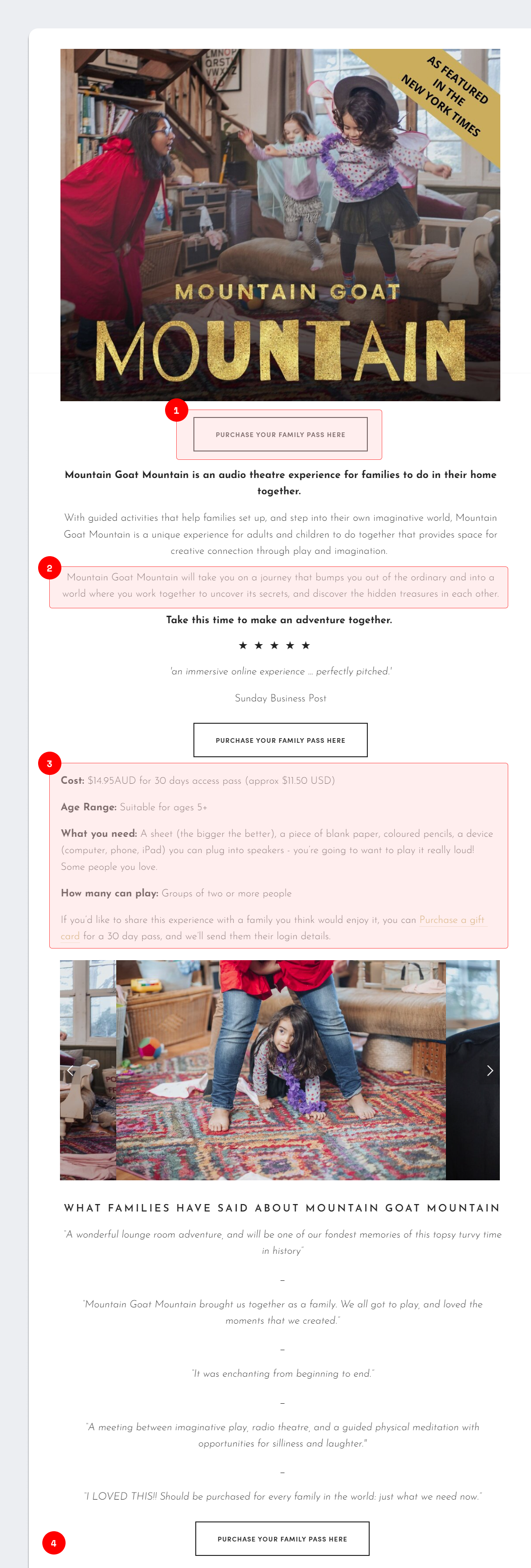
Analysis showed that the website was causing confusion for users:
Asking users to ‘Purchase your family pass here’, and leading directly to the purchasing portal. This meant the product page was skipping the ‘Add to Cart’ and ‘Checkout’ levels of the purchasing funnel.
Descriptions of the experience in the hero section described the emotional sense of the product, without letting parents know what to realistically expect.
Additional information was hidden below the page fold, and was skipped by users when scanning the page for information
Lengthy page meant that users experienced fatigue by the time they reached the end (if they reached the end at all)
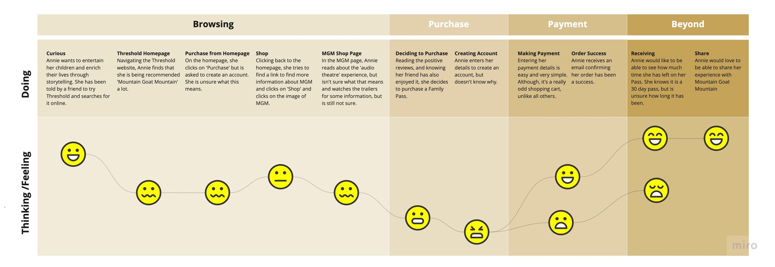
Customer journey mapping helped to begin visualising what barriers potential users were facing when entering the website for the first time.
The journey map showed us that users may face particular difficulty when purchasing their online experience. Due to being asked to create an account or being asked to input credit card information after clicking ‘Purchase’, an unexpected next step in the journey, this would begin to explain why Threshold were seeing a large drop off in the purchasing journey.
Defining the problem
After speaking with users and compiling information how how competitors and other eCommerce website perform, we began to plot our findings to determine where the pain points may lie:
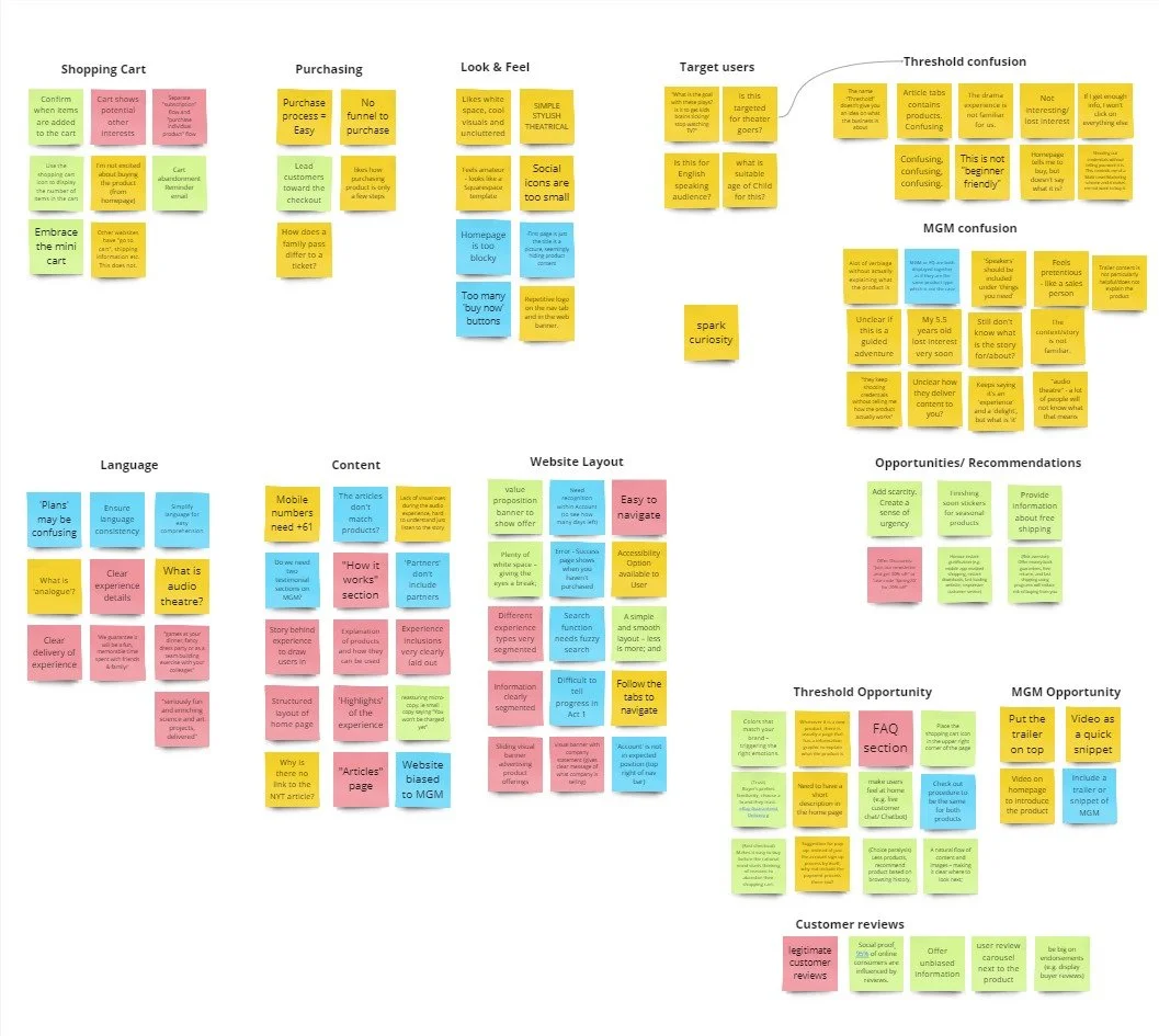
After affinity mapping, we found that there were four key pain points that users had:
"The site keeps saying it's an ‘experience' and a 'delight', but what is 'it'?"
Users were confused as to what Threshold offered, and didn't understand what the Mountain Goat Mountain product was.
For the Mountain Goat Mountain product, there was little information to get users excited about purchasing. From the homepage, you could click directly to a payment portal, which users found confusing.
"The homepage is telling me to buy, which doesn't tell me what I'm buying."
Lack of cart functionality limited users to being able to purchase only one item at a time, and lead to confusion about what they were purchasing.
"Other websites have "go to cart" and shipping information etc. This does not."
Users were confused about what the product actually was - as Mountain Goat Mountain is a new product to the market, the descriptions and information provided didn't provide insight into what they could expect.
"There is a lot of verbiage without actually explaining what the product is"
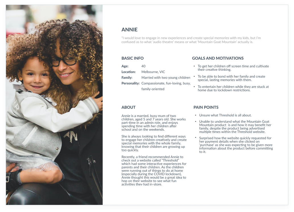
User and information building
Annie was a culmination of information from our client as to who their users are, and our research data.
She helped to represent who Threshold's users are, and allowed us to put a face to our research findings.
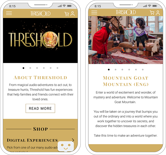
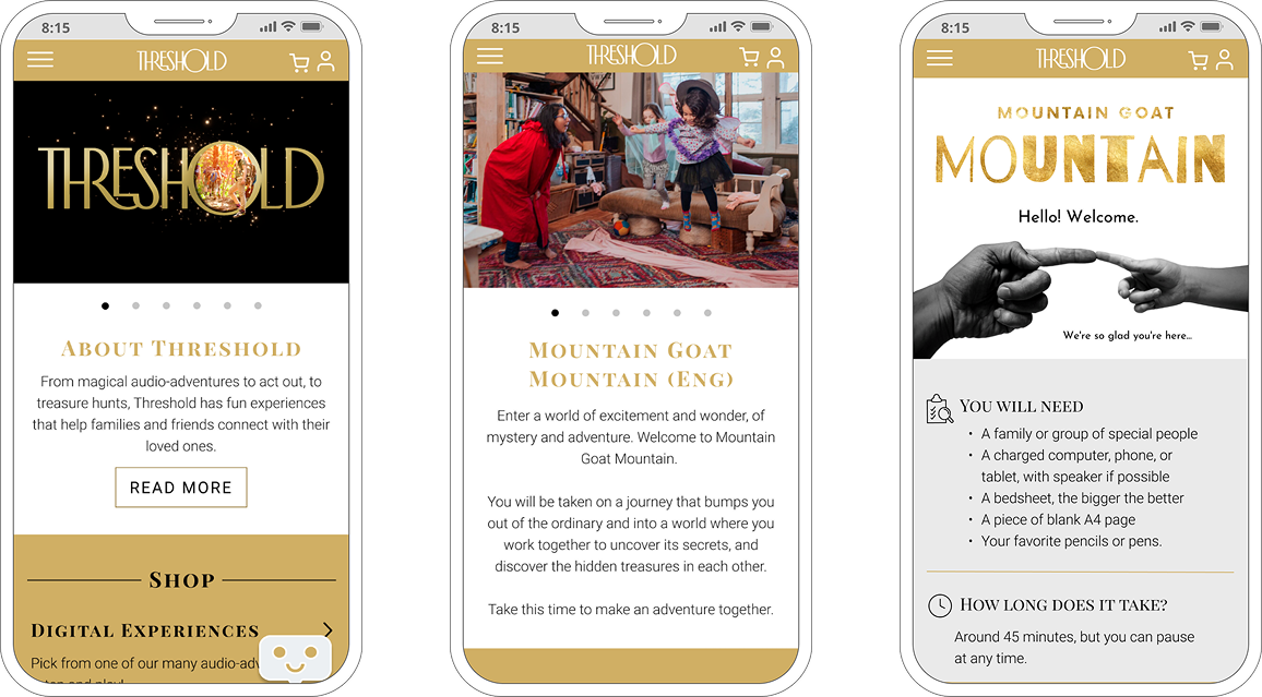
The old structure of the website weighted Mountain Goat Mountain more than other products, which confused users, as it made it appear that this was the only product Threshold offered or that there was something wrong with the other products. We decided to ensure that all products were weighted evenly.
We also wanted to ensure that all products had the same landing page template. Mountain Goat Mountain was the only page that had large amounts of information and imagery, and it was clear that a lot of time and energy had been spent on this page, which only highlighted the above point to users that there must be something 'wrong' with the other products if no attention had been paid to them.
Upon speaking with the client, they mentioned that they had a lot of new experiences in the pipeline, which we thought would be nice to show to potential customers as a little teaser of what's to come.
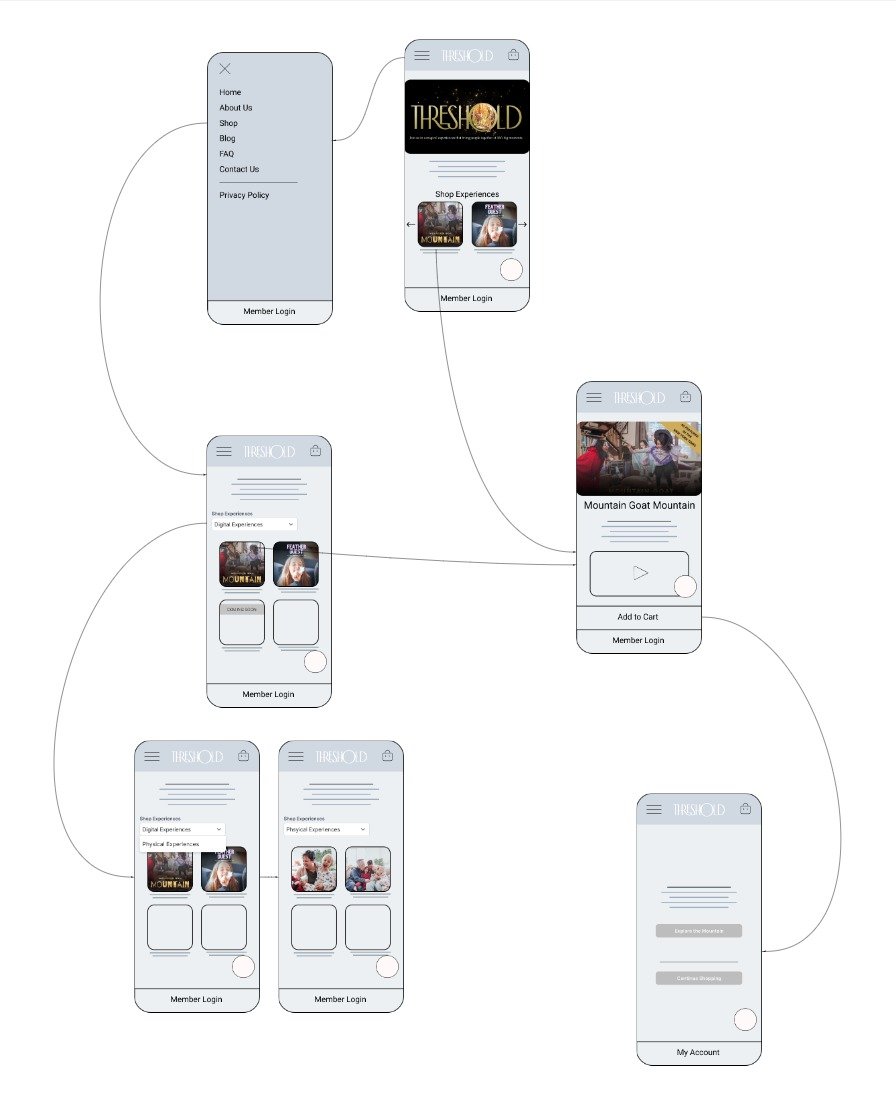
Information Architecture
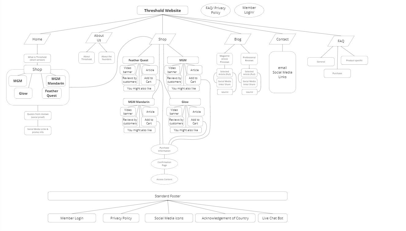
Refreshed flow: I created an updated architecture for the Threshold website to ensure that all products are evenly displayed, with categories for each type of product.
Wireframing and design
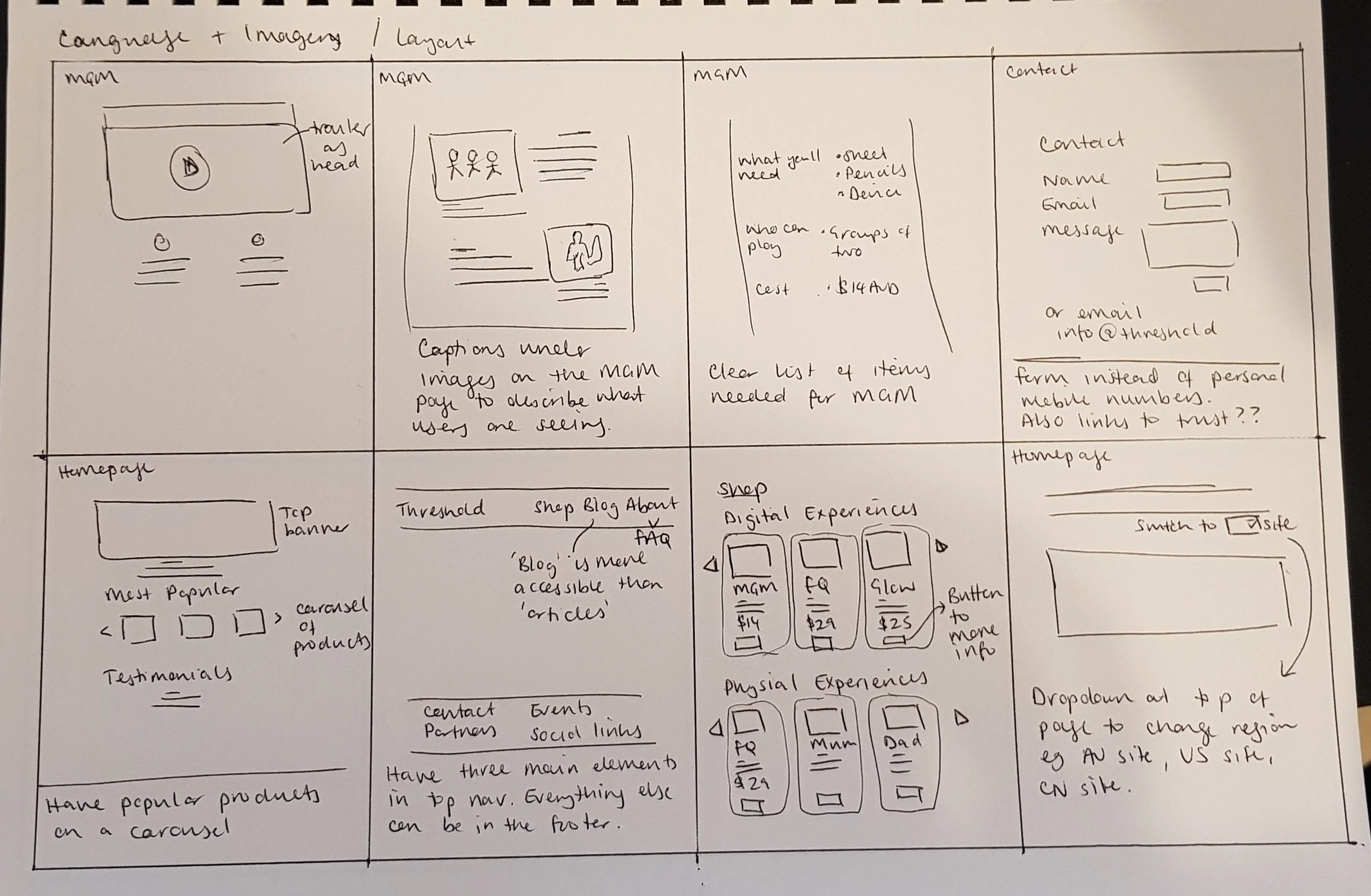
Ideation and wireframing
I created the below low-fidelity wireframes to help visualise how a simple purchase could be conducted through the website:
Improvements were made across the website, below is a top level view of the key optimisations made:
Design solutions
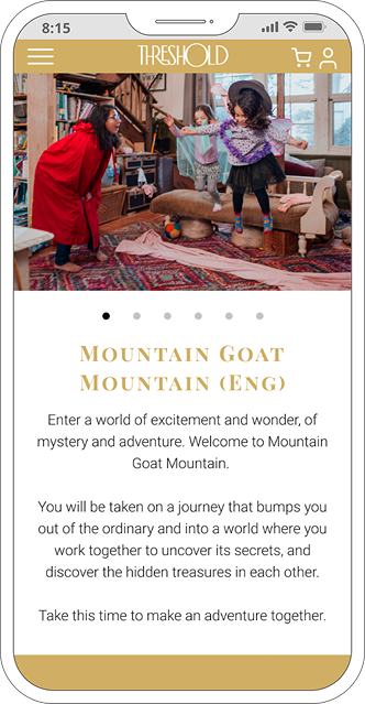
Clarity around what Threshold and its offering is
With the website holding an element of surprise for users, we knew we needed to spark curiosity in potential customers.
The addition of a clear 'About' section, as well as clear product information, ensures that the user will have a basic understanding of what product they're buying and what to expect.
The usage of a chatbot was also integrated. Feedback from the client was that people often email them the same questions - a bot can alleviate this by being available to answer simple questions.
Added Cart functionality
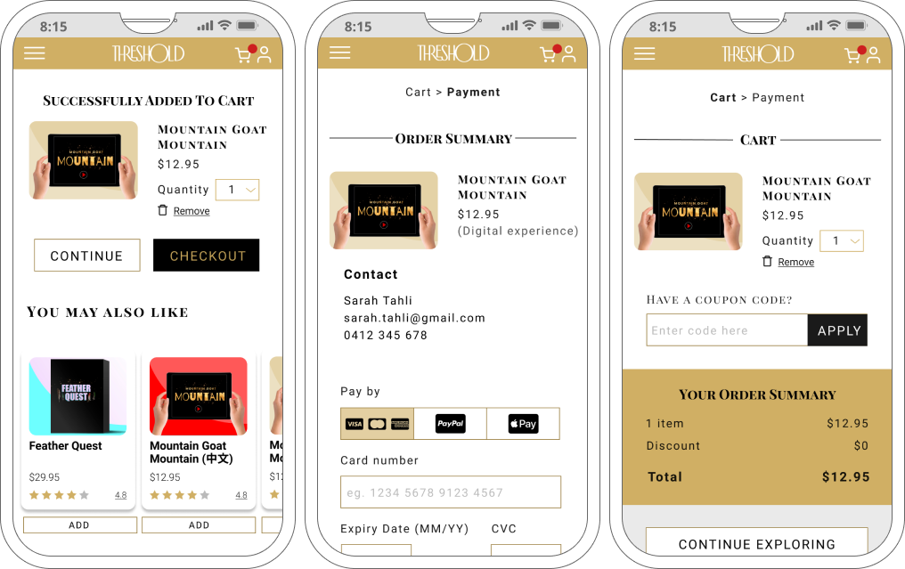
The lack of a cart was confusing to users; when clicking on 'purchase', users were taken directly to a pay wall, which was jarring as this was not consistent with what they normally expect to see.
We added a clear cart icon, where users could see that they had added something to their cart.
A Cart page was added to tell users that an item has been added to their cart, and to suggest similar products that customers may also be interested in.
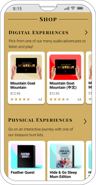
Clear distinction between digital and physical products
Previously, all products were sitting next to one another in the 'Shop' and users would have to click on each item to read more about what to expect.
Upon listing all products within the 'Digital' or 'Physical' sections, it is now immediately clear to customers what they can expect.
A parent looking for a collaborative experience they can do over a video call with grandparents can head straight to the 'Digital' section, or one who is looking for a quiet activity at home knows to go to the 'Physical section.
Prototype
High fidelity prototype
The client was happy with the low-fidelity wireframes, so we proceeded to high-fidelity designs. The UI elements were created by a designer, and I made a prototype to showcase to the client.
Click on the image to the right to be taken to the prototype.
Reflection
The main goal of the project was to provide a strategy for success, rather than a full suite of designs. I feel that we not only provided the client with a framework for how best to present the information, but a good solution on how to implement it using the assets they already had so they could start updating quickly.
Learnings
As this was a project completed in a team, with Academy Xi, for future projects similar to this, I will dedicate time to ensuring all members of the team are aware of exactly their priorities for the project.
As this project had a very short time span, in future I would like to make sure to touch base with the client post-project to work with them future on optimisations, and learning how to continue to iterate using limited resources.