Victorian Trials Cancer Link
Product Optimisation
Cancer Council Victoria
Victorian Cancer Trials Link (VCTL) is a public database created by Cancer Council Victoria that houses information about cancer clinical trials being conducted around Victoria.
It is used by both those affected by cancer and health professionals as a source of information about available trials.
Users were struggling to understand what they were required to do upon entering the site, and were unable to find the information they were looking for.
Overview
Through our research, we discovered that we need to simplify the information being presented to users, and structure the website such that multiple user types would easily be able to find a trial.
I provided a suite of wireframes based on the research findings, along with a post-project data visualisation dashboard to measure on-going success and identify future optimisation opportunities.
The Impact
Duration
October 2022 - October 2023
Tools
Miro
Figma
Google Analytics
Looker Studio
Team
1 UX Designer (me)
1 Service Designer
1 Digital Lead
2 Developers
3 Trial Leads
1 Designer
My role
Project management
User interviews
Competitive analysis
Data synthesis
Wireframing
Prototyping
Discovery
3
User Flows
16
User Interviews
1
Survey
Those affected by cancer, their family, friends, or carers. These users were looking for information about specific trials they had heard about, or information about cancer clinical trials and what they entail.
Health professionals. These users were looking for specific cancer clinical trials suitable for their patients.
This project focused on those affected by cancer as our primary user base, with health professionals as our secondary user base.
A survey completed in 2021 identified that our target audiences were:
Along with the Clinical Trials Lead, I interviewed 16 users (yes, there was over 16hrs of recordings to sort through!), including people who had cancer and were included in a trial, carers of those who had participated in a trial, clinical oncologists, clinical trial specialists, and 13 11 20 cancer nurses.
Through these conversations, we identified four pain points:
included information directly from the trial source, including wording that could be challenging to the every-day user
assumed the user already understood what to do with the information presented to them
Complex language
lack of information lead users to believe trial data was out of date
redundant information on trial pages lead to users believing trials information was not correct
Confusing trial information
users wanted to know how they would be impacted by participating in a trial
users wanted to understand the details of specifically what the trial would entail in plain language
Unclear investment
Dead ends
trial pages included no calls to action
patients were confused about what they needed to do next
no further support options were presented to users
I also undertook a heuristic evaluation of the website
Below is a selection of the key issues found.
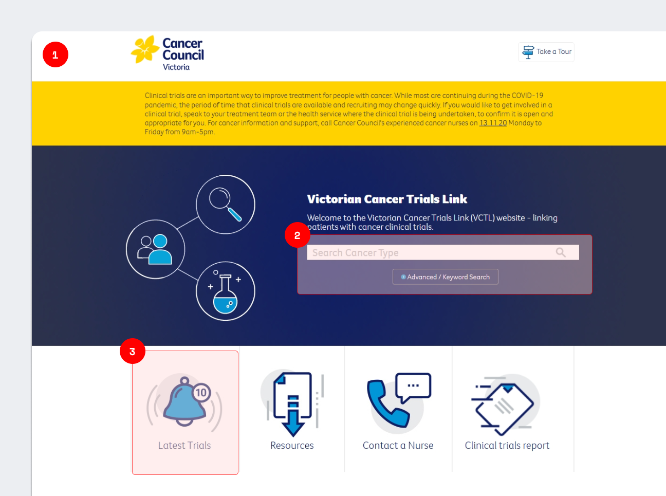
Before: Homepage
Dated design lead users to believe that the website was out of date and not being updated.
Search functionality did not include a ‘Search’ button. This lead to users to assume they needed to click on ‘Advanced/Keyword Search’, which made the search results confusing, especially for those without a medical background.
Latest Trials button was redundant. Users will always search for specific terms related to them/their patient, which makes a list of any recent trials irrelevant.
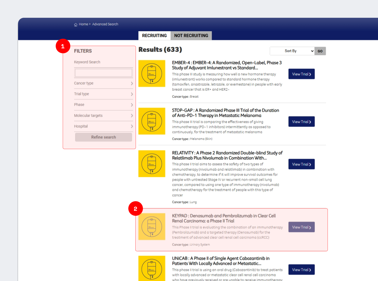
Before: Search Results
Page did not display previous search terms, leading to users being unsure about what they had looked up on the homepage. Filter also included ‘Keyword Search’ which was different terminology than used previously, and lead users to believe they needed to be searching for specific words, rather than a cancer type.
Trial results were shown as a preview of text, without any specific information. Users mentioned they found this difficult to scan to find relevant results to them. Iconography used was also not explained to the user, rendering them meaningless.
Before: Trial page
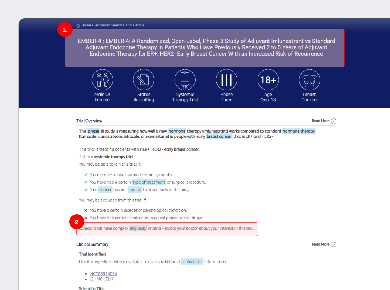
Trial pages used the scientific headline. This caused those with cancer to be overwhelmed at the amount of information shown to them. Pages also did not include key information such as dates of the trial, or whether the trial was currently recruiting for participants.
Eligibility criteria disclaimer was not highlighted, leaving users to believe the list above was all required.
Ideation
After gathering our insights, the Service Designer and I determined what each of our two main users would want to achieve:
To find new trials relevant to them. This could be through searching for a specific cancer type, or specific drug type. We found through interviewing users that many were part of groups where discussions of drug types were common, so this was something that was important to note.
To be able to quickly digest information about trials, without having to read all the details. This could include the location, or whether the trial was currently recruiting for new participants.
To be able to learn about cancer clinical trials, and to be able to find support if needed. This was especially important for family/friends/carers, as they may receive less information, or not be in the best emotional state to absorb a lot of information when attending appointments.
Someone affected by cancer
To find new trials relevant to their patients, and be able to search for specific information about their patient’s cancer type.
To be able to easily share information with their patient if needed.
To be able to guide participants, their family/friends/carers to support. The role of the health professional is to get the participant treatment for their cancer, so they may not be able to provide the level of care required.
Health professionals
Wireframes
To solve the areas of opportunity identified for each user, we built a suite of wireframes, focusing on each page of the website.
Below are example of wireframe iteration I created for the homepage.
V1
Closely aligned with the previous iteration of the homepage, and placed a focus on our two main users, leading them to their own content hubs.

V2
After discussions with the team, it was decided that there needed to be an emphasis on placing the content on the homepage.
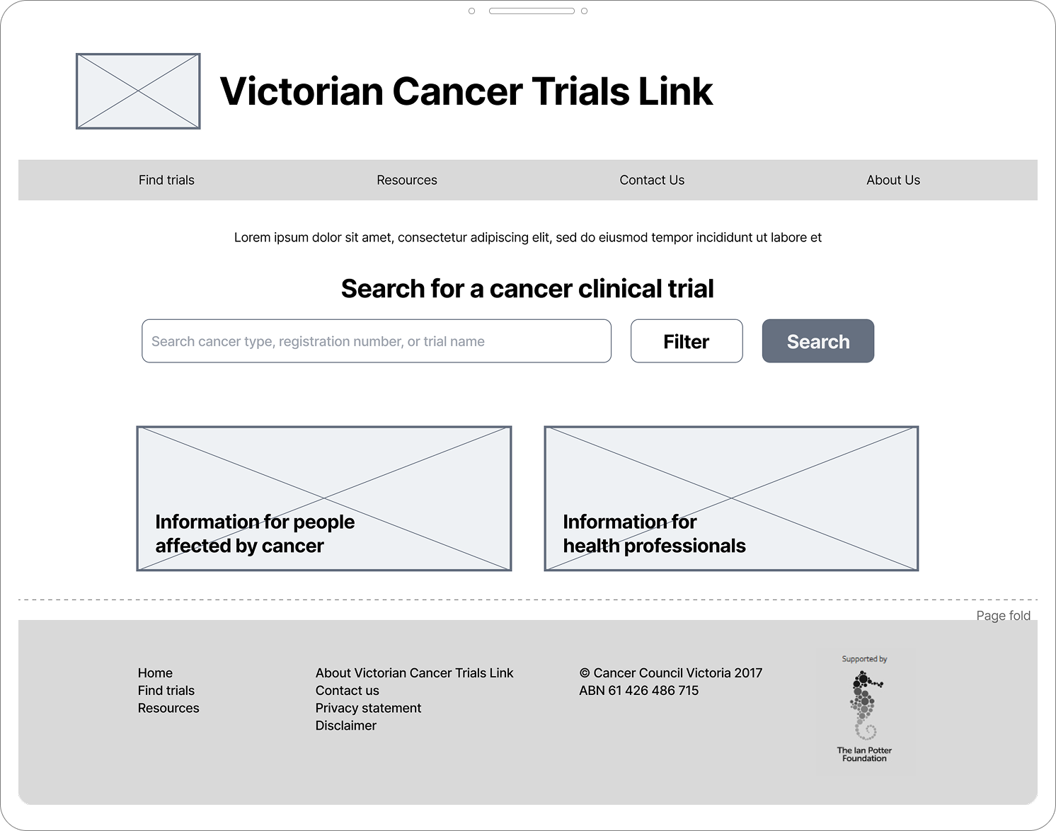
V3 (chosen)
Further discussions lead to a condensed homepage. Links lead users to relevant pages, while the focus remains on searching for a trail.
Design and outcomes
High fidelity designs were created by the in-house designer and were applied to the chosen wireframes. Below is a snapshot of the key pages.
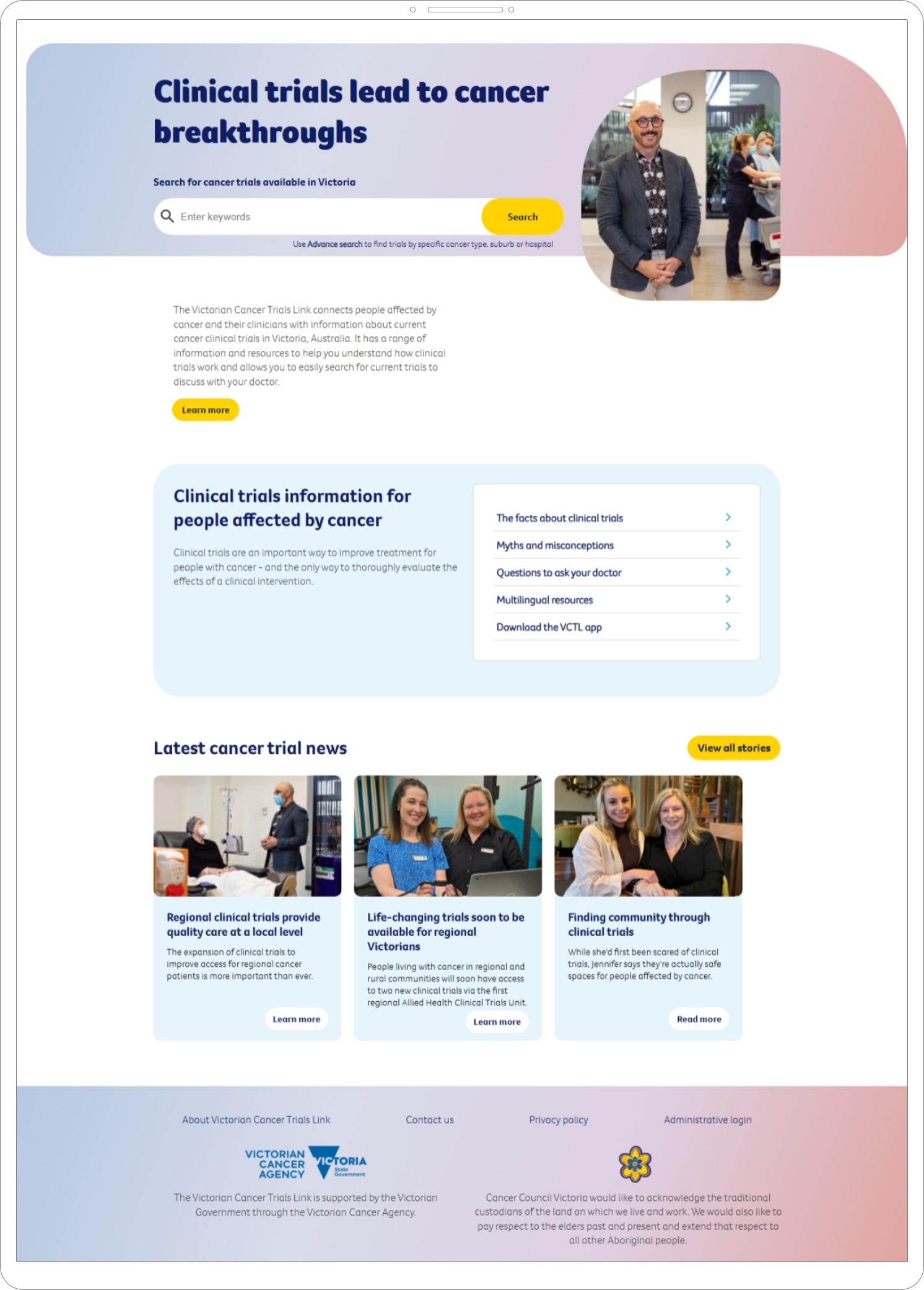
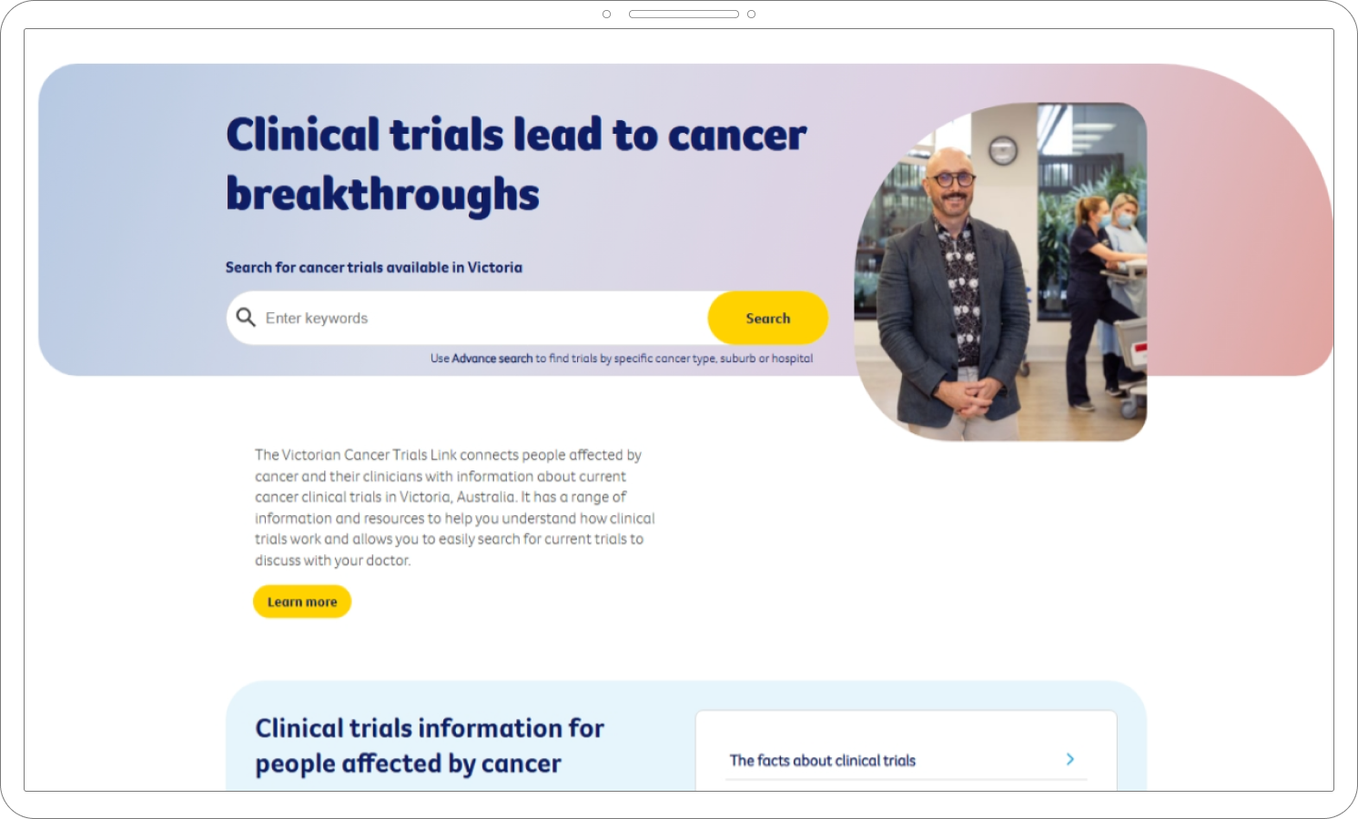
After: Homepage
Refreshed design and usage of imagery of real oncologists allows participants to feel more at ease with using the website
Search functionality is clearly labelled with what users can do. Post-interviews with users have shown that even though the main functionality of the search has not changed, the addition of the ‘Search’ button has made it clear what they need to do.
Relevant and up-to-date content directs users to news articles, information about trials, and further support options without having to search or hunt this down.
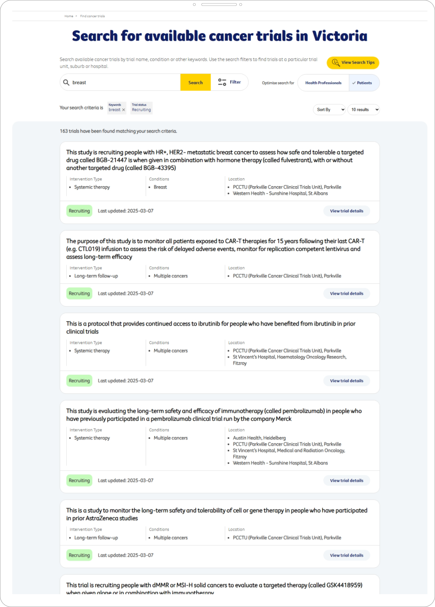
After: Search Results
Displaying of previous search results has reduced mental load of users, who no longer need to remember their exact terms.
‘Health professionals’ and ‘Patients’ toggle now allows users to display information in a way that is relevant to them and their understanding. Patients will see a plain language (as much as possible) title and locations, where Health professionals will see a scientific title and reference to trial identifiers.
Addition of ‘Last updated’ and Recruiting badge allows users to scan this important information on all trials.
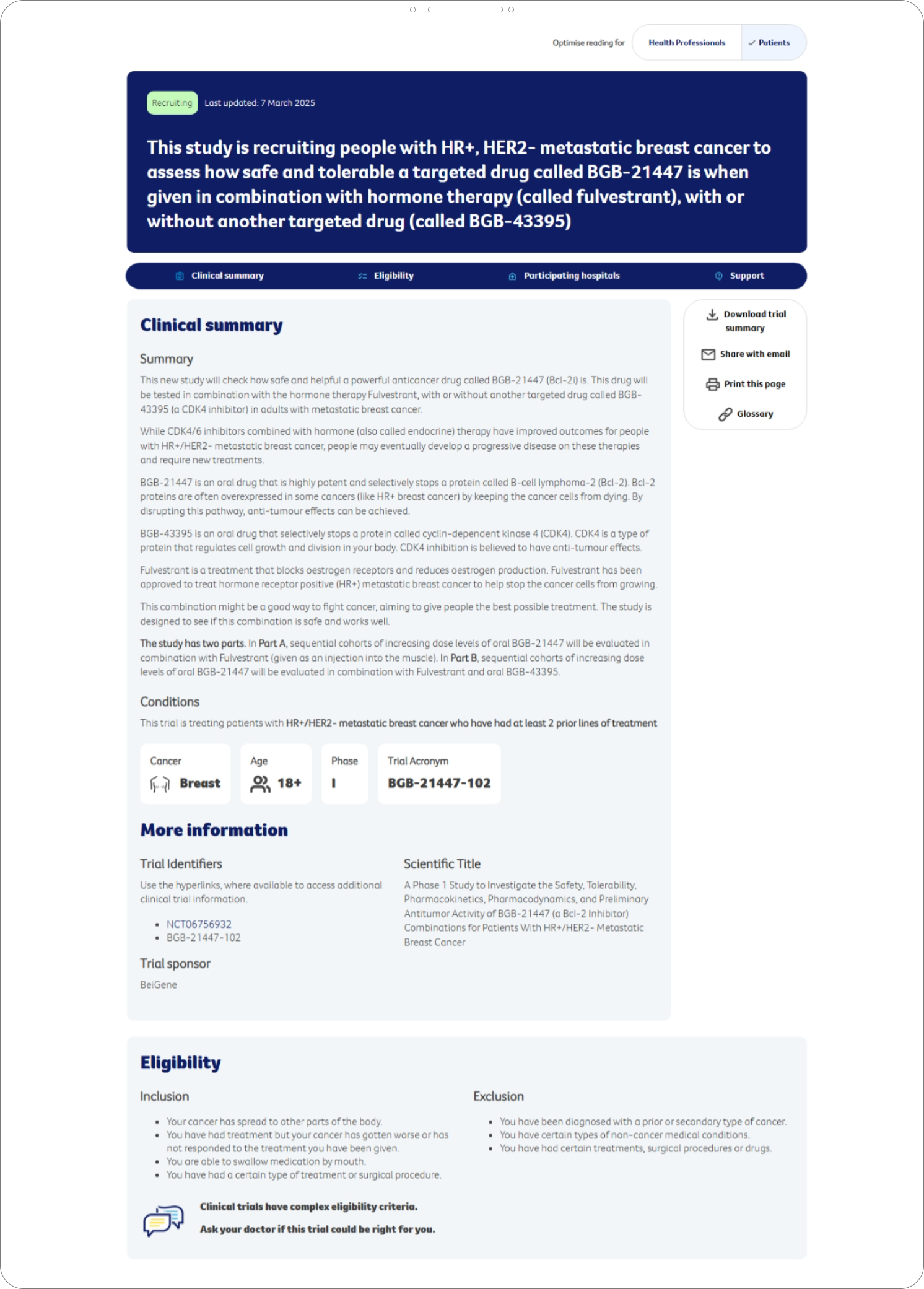
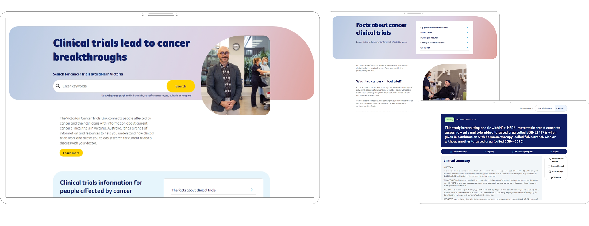
After: Trial page
Website outcomes
Due to confidentiality reasons I’m unable to go into depth about the outcomes of the website post-launch, but I am able to share:
+2,080%
engaged sessions
+2%
time on page
+7.9%
engaged sessions per user
Headline aligns with the view the user has chosen. This now allows participants to read the trial information in a way that is understandable to them. The addition of a plain language summary also allows participants to delve into each trial without having to decipher clinical language
Eligibility criteria disclaimer has been elevated in hierarchy to ensure that this is not missed. Participants need to go through their health provider in order to proceed.
This increase in engaged sessions is significantly greater than expected. This is largely due to the revamp of content on the website, and addition of content hubs. The content hubs has allowed the website to be optimised for search, and increase public perception of clinical trials.
Due to the significant traffic increase on the website, this incremental change in time on page is seen as a success. One of the main KPIs for the project was to not decrease the time users are spending, as the team wants users to read and understand content and trial information.
Through the addition of smaller CTAs on the trial pages, and a clearer path to success, our engaged sessions increased nicely.
This is also attributed to the addition of a new suite of content pages.
Reflection
The broad aim of the project was to refresh the old VCTL website, and provide information to those affected by cancer with the resources and support they may need during challenging times, and I feel that we achieved this goal.
Looking at how the website has tracked since it’s update, there have been incremental improvements in the user engagement of the website, but most importantly due to the implementation of tracking on all elements of the filters, CTAs, and content, the team are now able to see exactly how users are utilising the website.
Due to the limited time and budget, the schedule put in place prior to me joining the project did not include post-user interviews or usability testing. In future I will endeavor to ensure that these processes are in place, as it is so important that we take learnings from those who are using the end-product.
Working with a larger group allowed for some amazing cross-collaboration between departments of the organisation that normally wouldn’t work together. For future projects of this size, I will take into consideration that regular catch ups are important for all team members, not just those who are needed at a particular stage of a project. This allows for important context to be given to everyone in the team, and allows all members to have the same information.